Great British Chefs
PRODUCT DESIGN / WEB / DIGITAL
I was lead designer responsible for redesign of core Great British Chefs website which combined a visually impactful site whilst improving KPIs by lowering bounce rates and increasing time on site and page views. Two designers worked under my guidance throughout the project. Working from idea conception through to testing, I was involved in all stages of the process. During this time I worked in a small team wire-framing the new site, planning the UI and UX, conducting user testing and was the lead designer responsible for the visual design and UI of the website.




Mobile Solutions
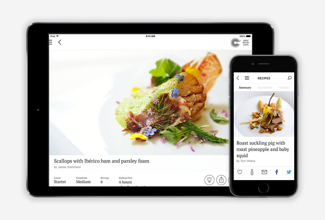
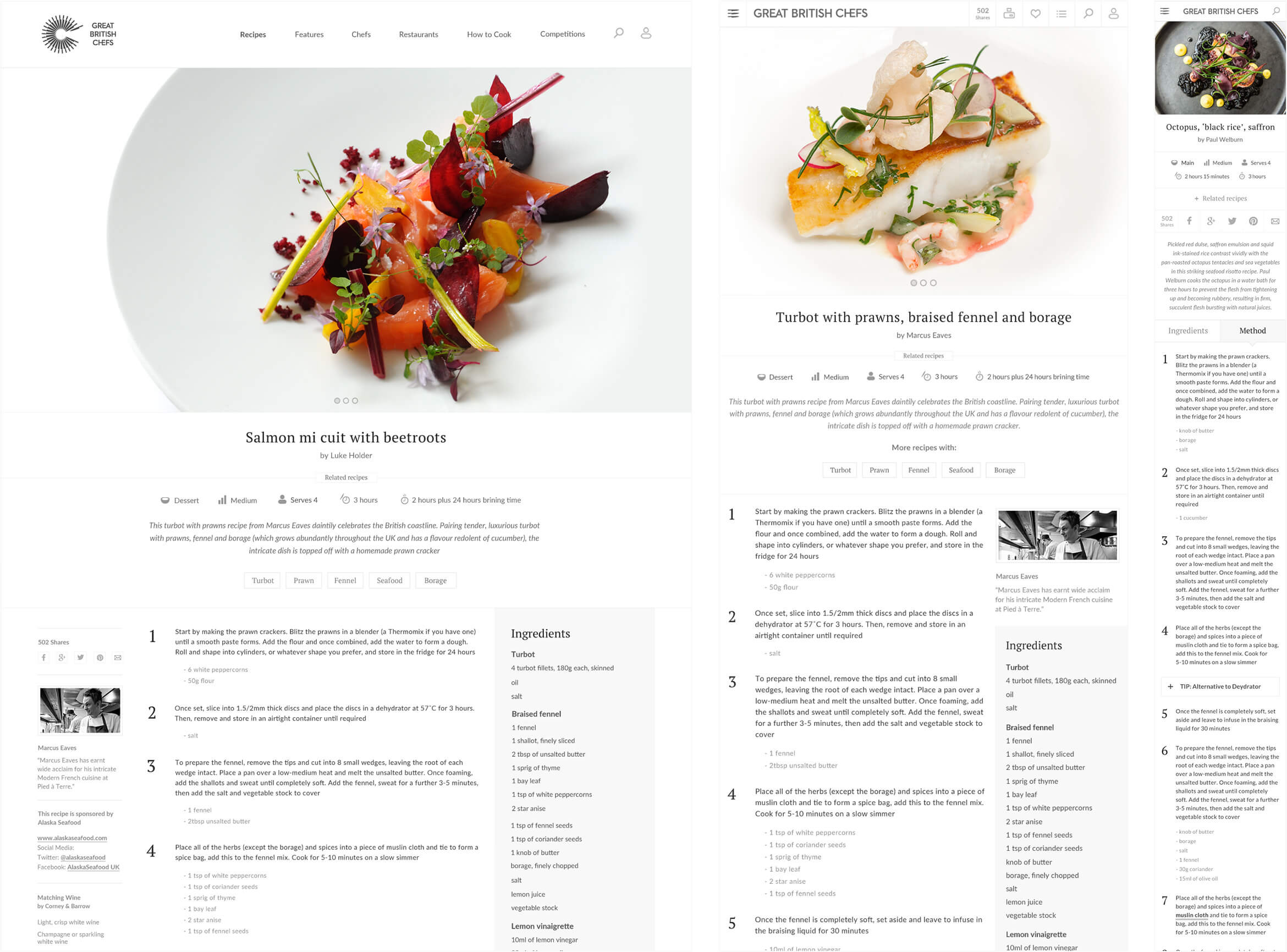
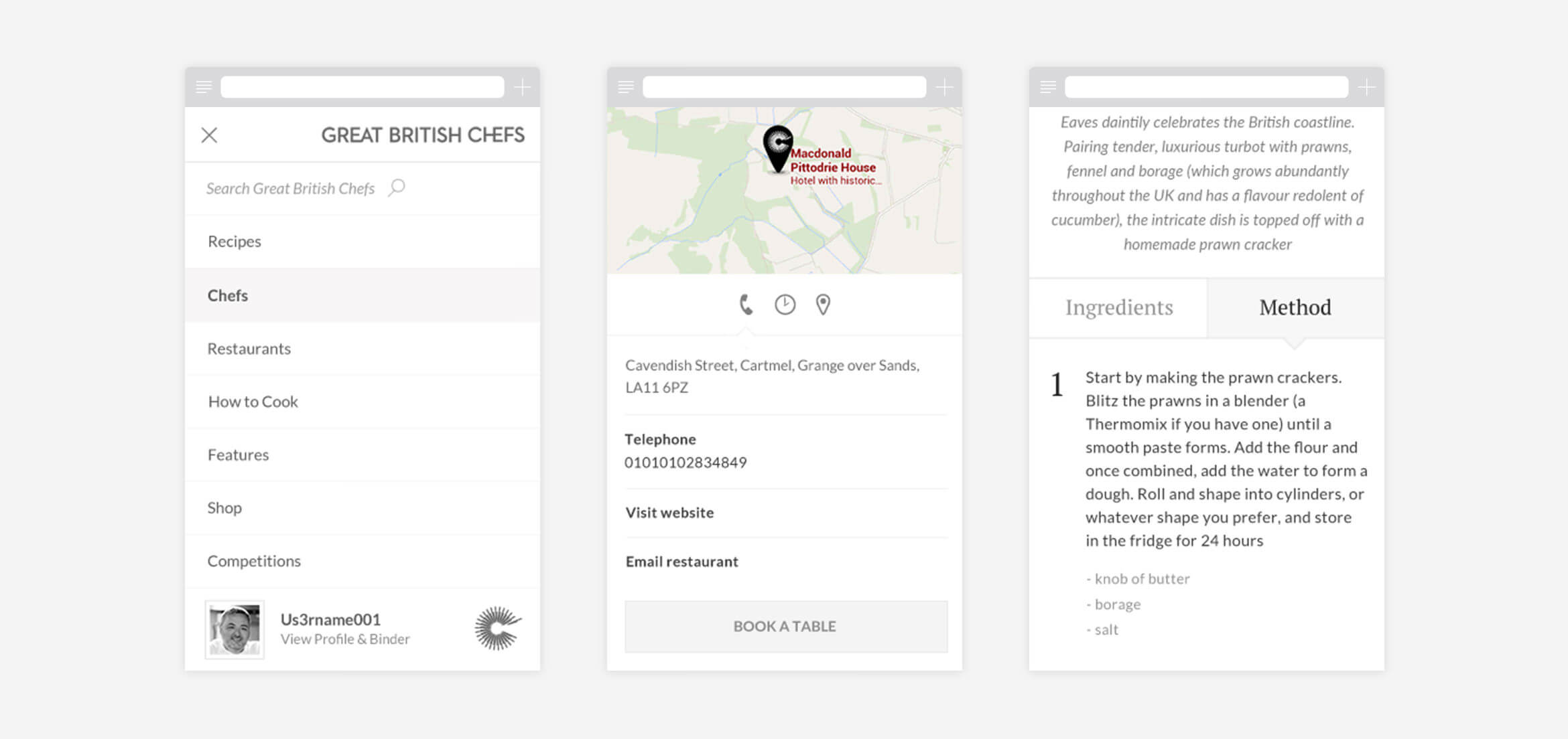
One of the problems with the old site was the giant mobile growth which it wasn’t able to cope with and resulted in high mobile bounce rates. Therefore, mobile users were one of the focusses during the design process with every template and page thoroughly thought through from a mobile point of view. This meant that many of the modules were tailored to mobile and the some layout were reworked to accommodate a mobile user’s needs. Since launch, this has resulted in a significant drop in mobile bounce rates.


Visually Impactful
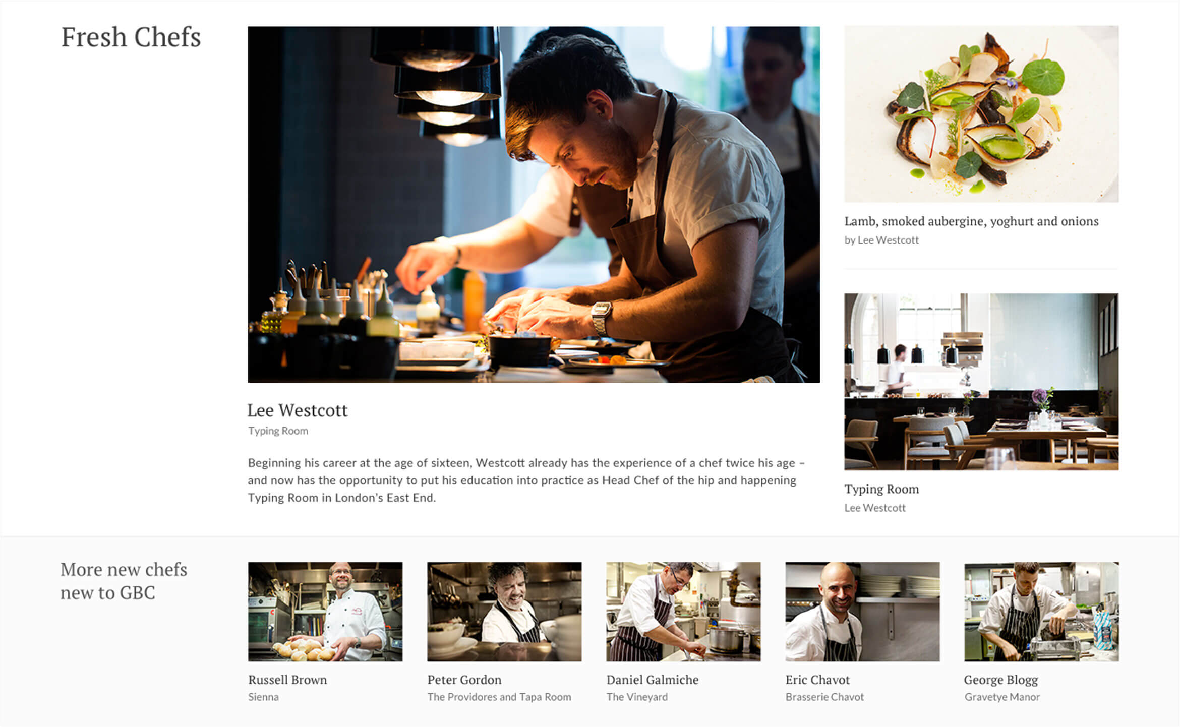
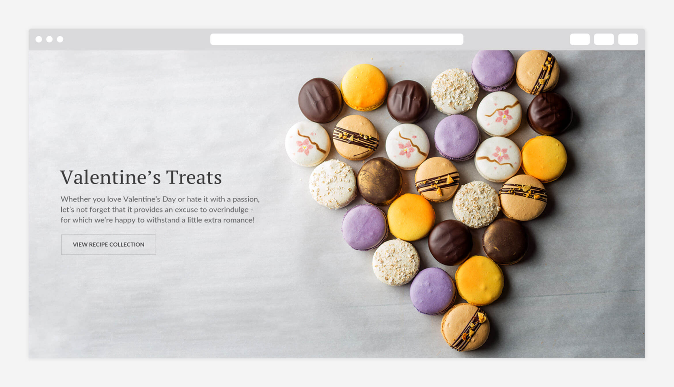
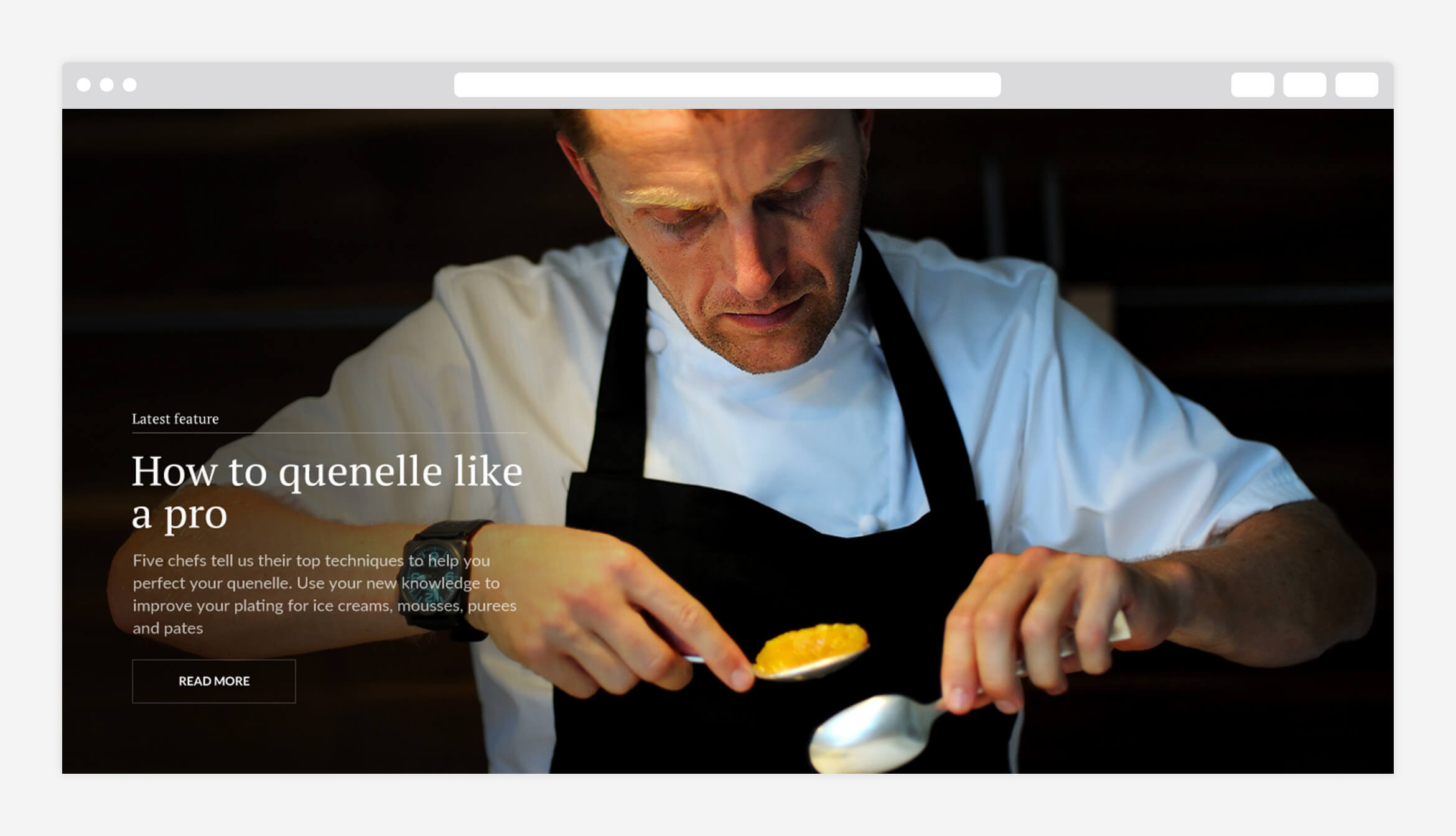
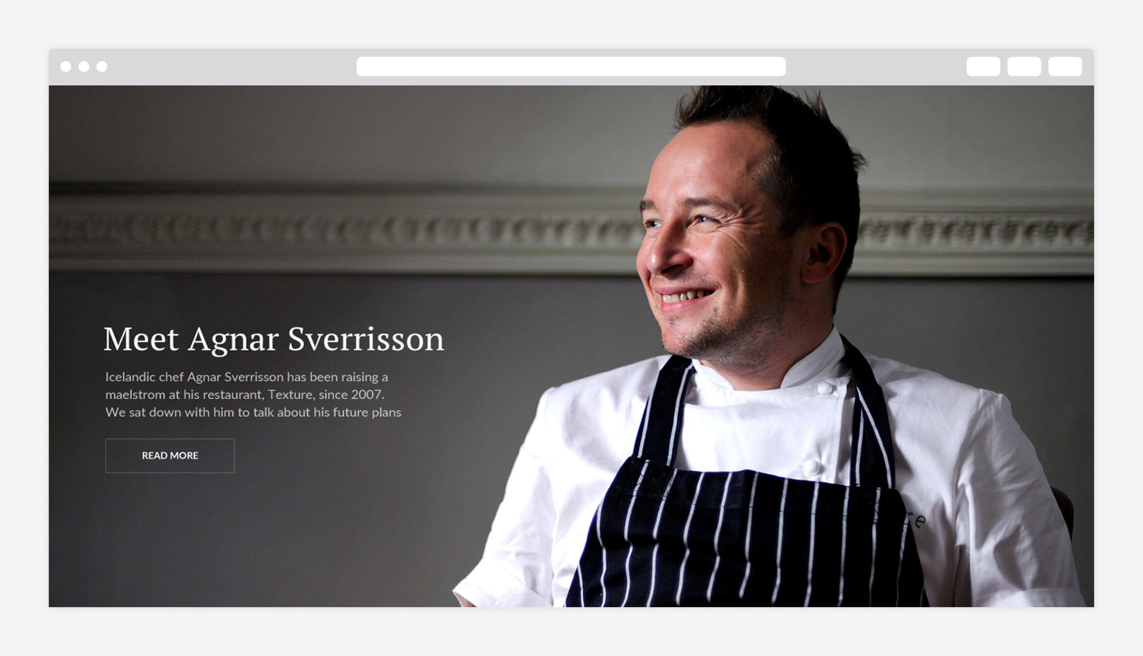
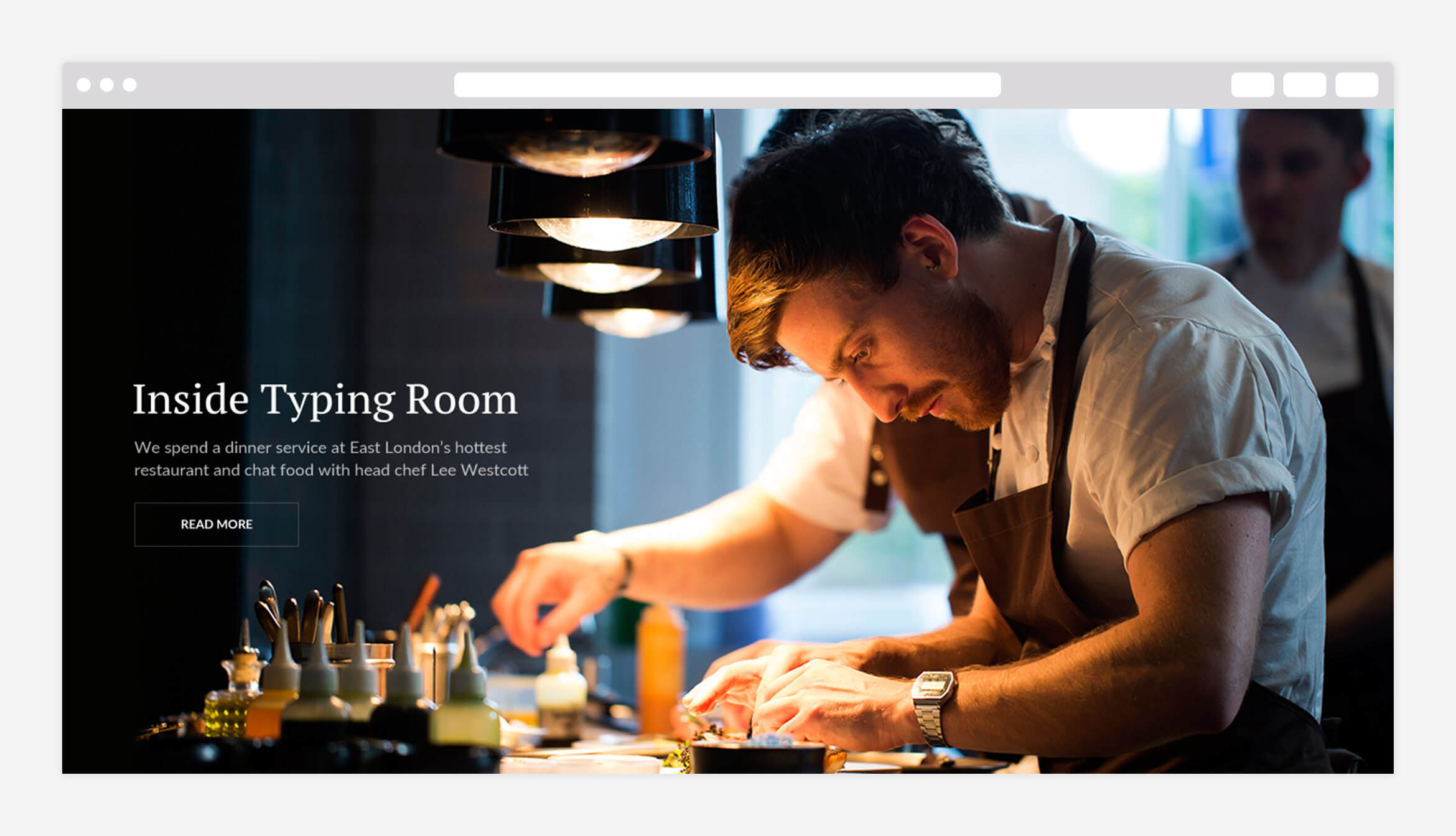
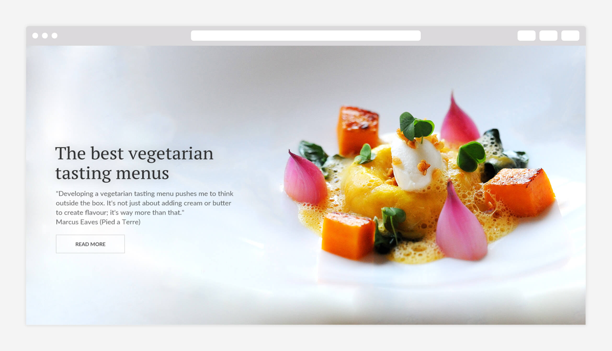
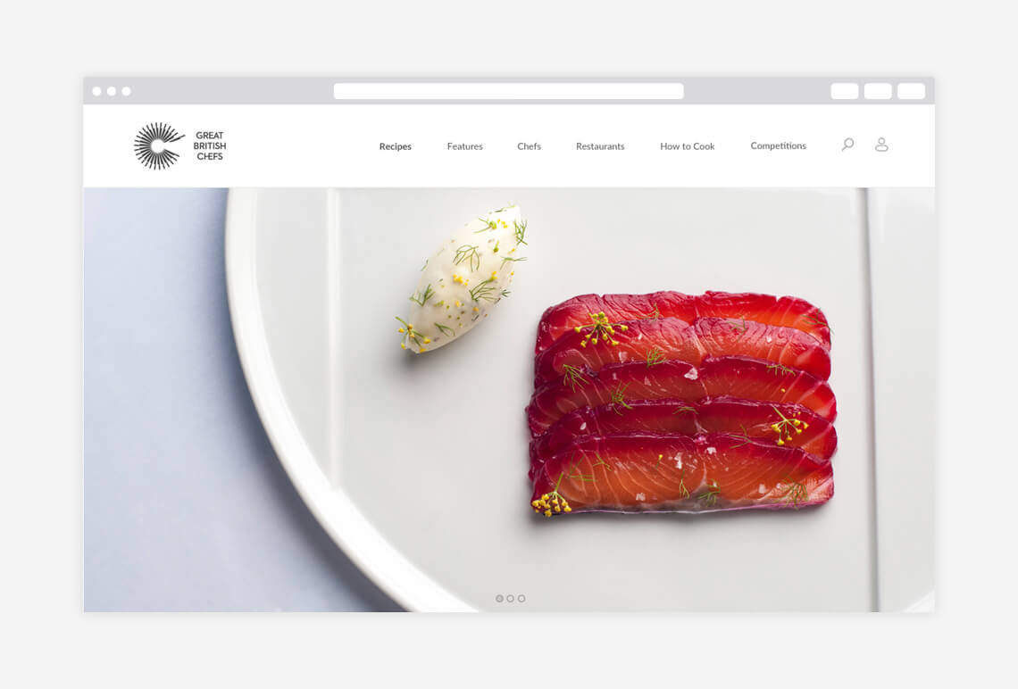
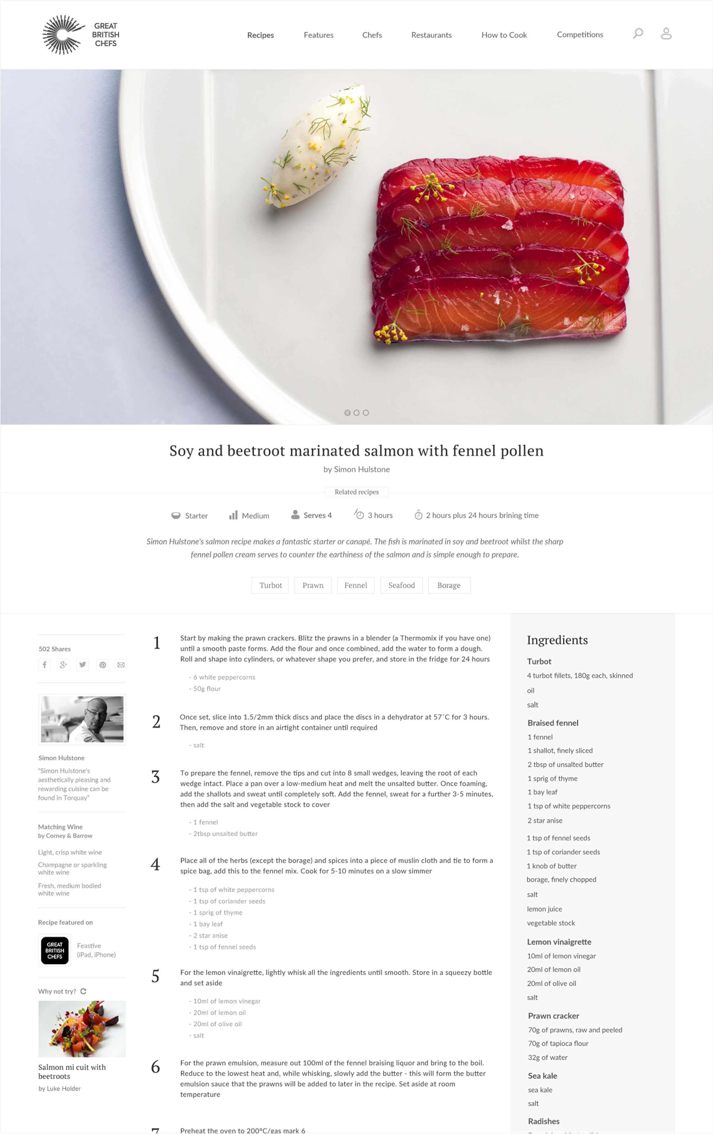
Great British Chefs has some of the best food images online, however the old site didn’t do enough to showcase these in their full glory. On the responsive site the images are front and centre of the design with highly visually impactful full-width lead images and visual recirculation modules. By limiting the colour palette, it lets the images shine and bring colour to the site in that way.



User Engagement
During the briefing, I was tasked with finding design solutions to increase users’ time on the website.
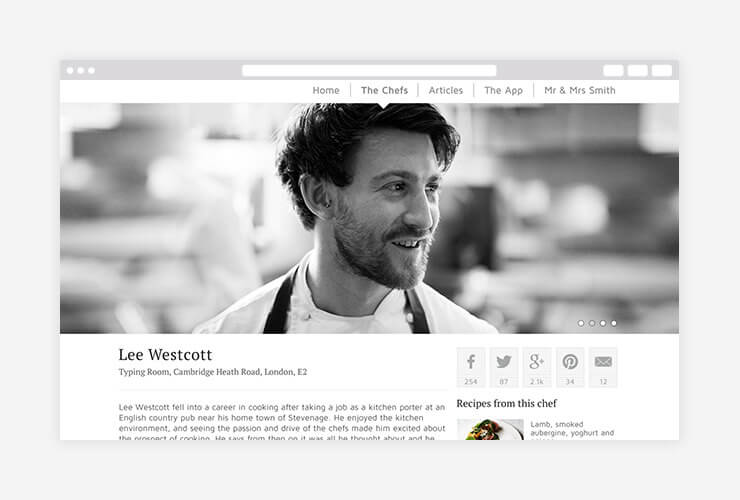
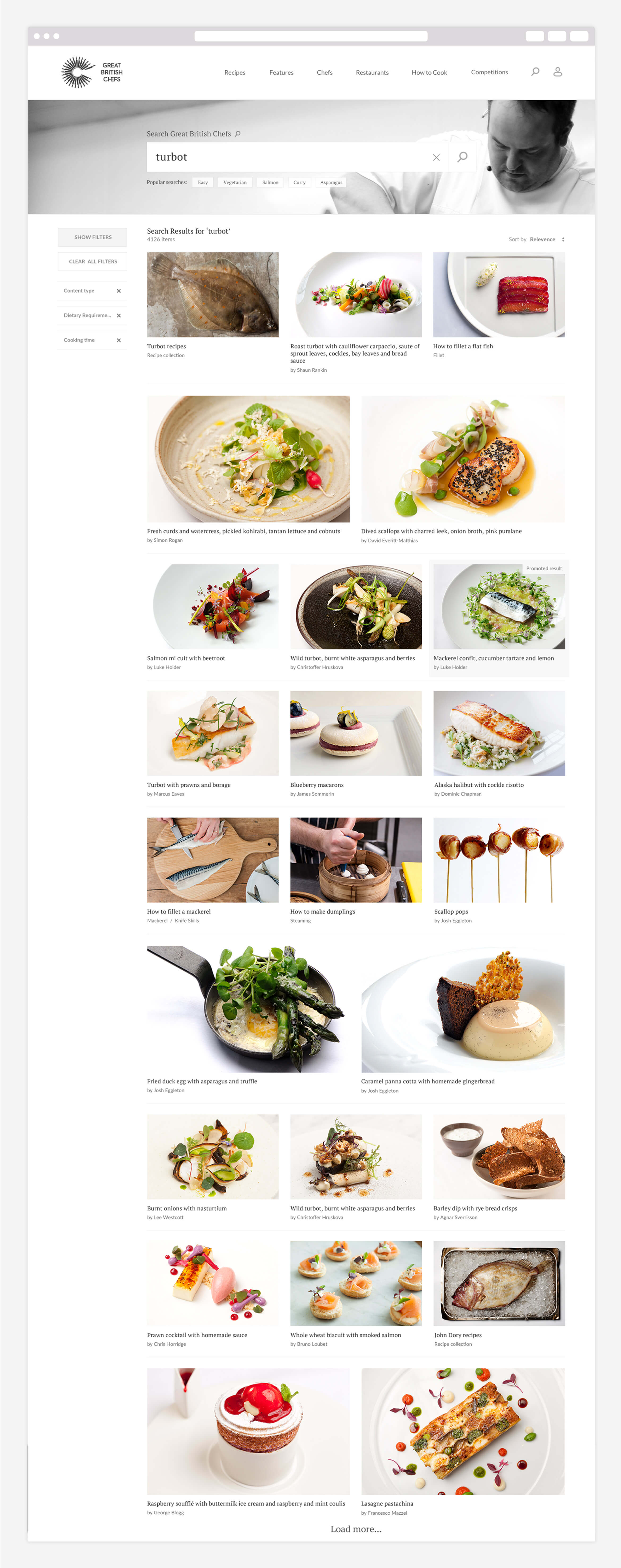
This resulted in the introduction of a long-piece editorial feel to pages such as the chef and restaurant profiles as well as the new Features section. Another way was to create recirculation blocks with impactful placements showing highly relevant content from around the site. These had ‘load more’ buttons to give users seemingly endless browsing options. We also put the users ‘binder’ function in prominent positions throughout the site to encourage users to return and engage more with the content.
Post-launch the average time on site rose to the highest amongst recipe website competitors.


